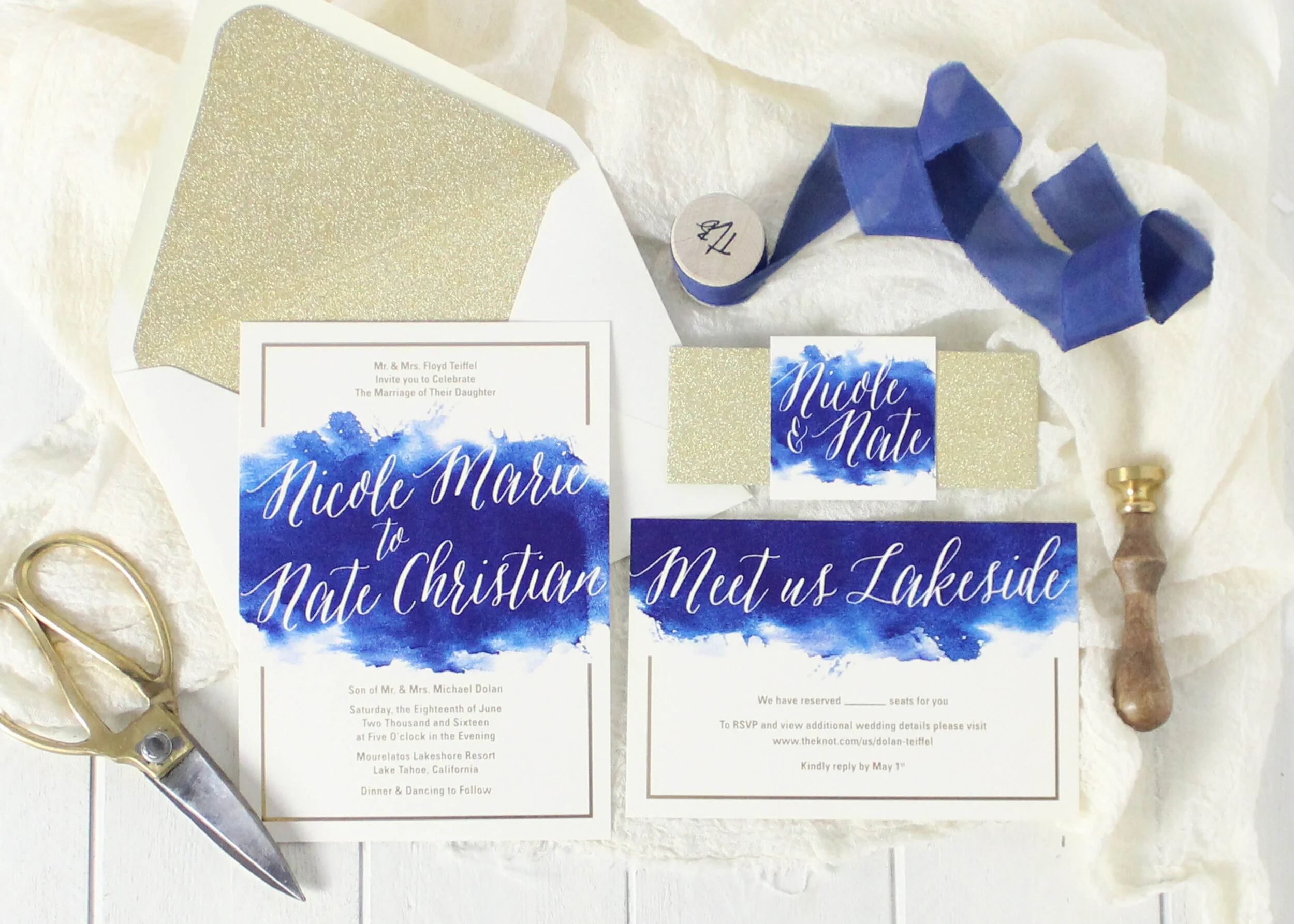
2020 will be a big year for weddings, I just know it. And when it comes time to plan wedding cakes, invitations and decor, I recommend picking a color scheme to work with. A selection of three to five colors makes selecting your products easier, and also more cohesive. One of the best ways to find beautiful wedding colors is to start with Pantone’s Color of the Year.
For more than two decades Pantone has named a color of the year every year. This year’s Pantone Color of the Year is classic blue.
The color experts describe this hue as “instilling calm, confidence, and connection, this enduring blue hue.” The company also explains the medium-blue color as “highlighting our desire for a dependable and stable foundation on which to build as we cross the threshold into a new era.”
Classic blue, the 2020 Color of the Year, reflects sustainability and strength in the start of new things. Sounds pretty fitting for a wedding color palette, no?
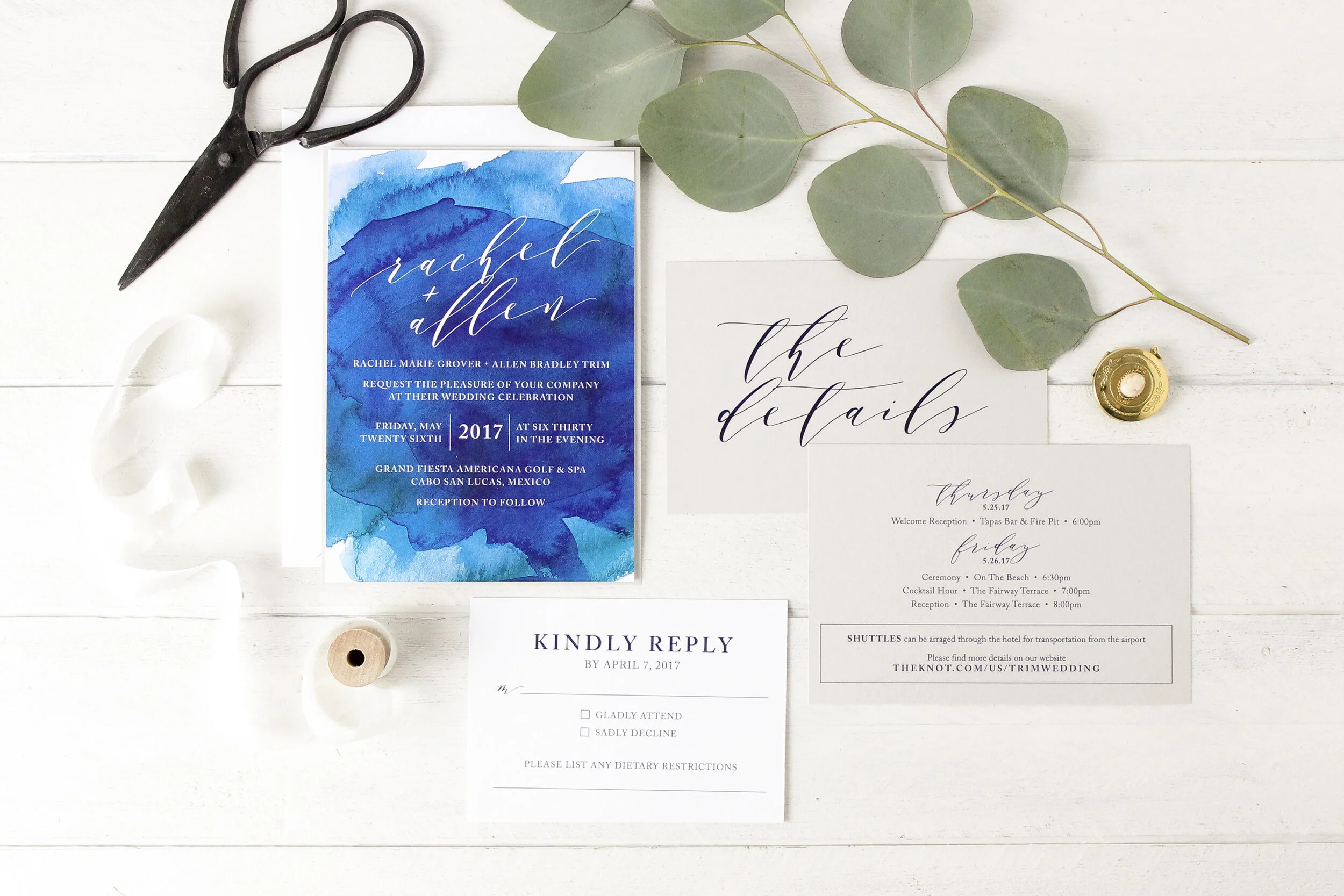
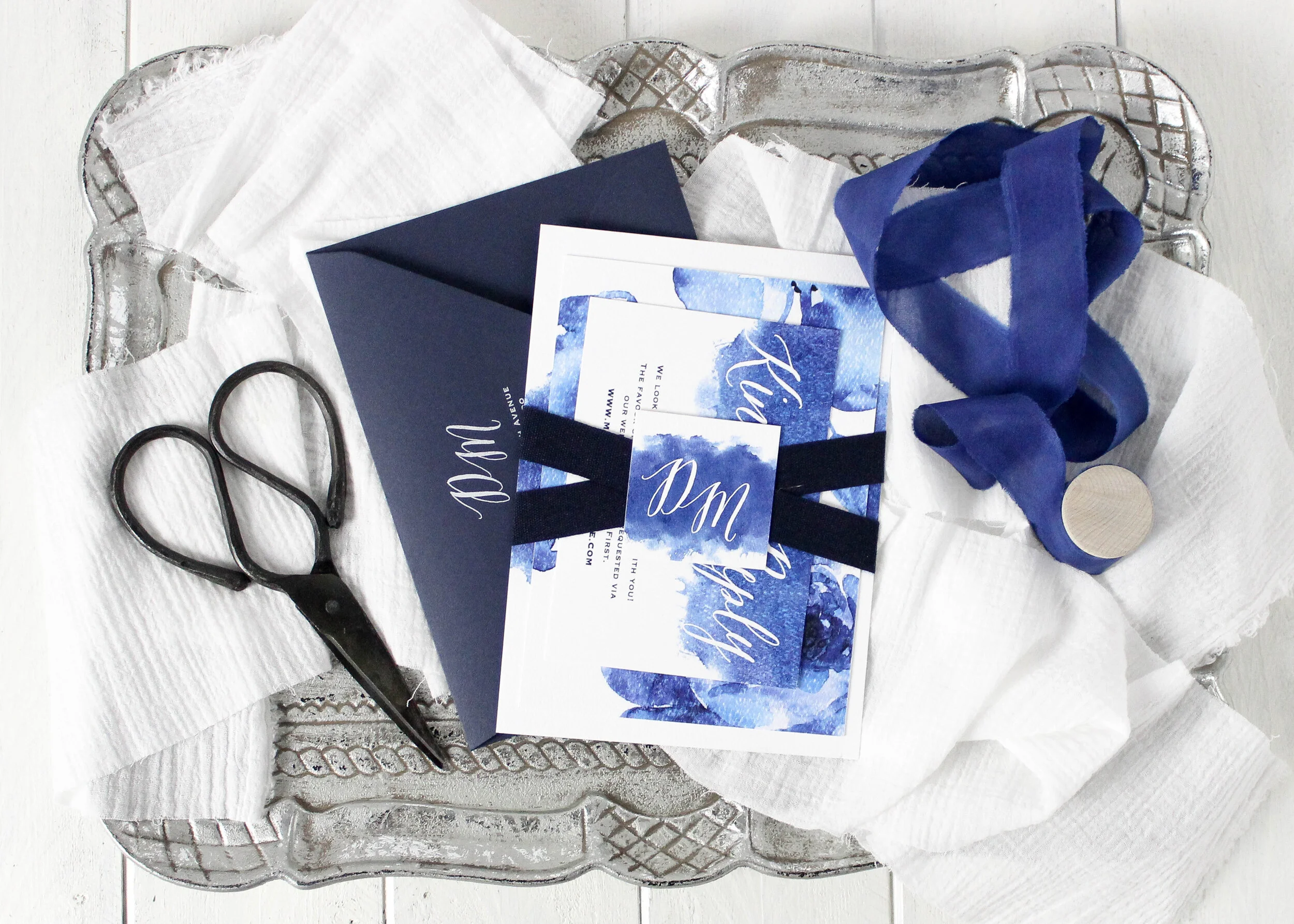
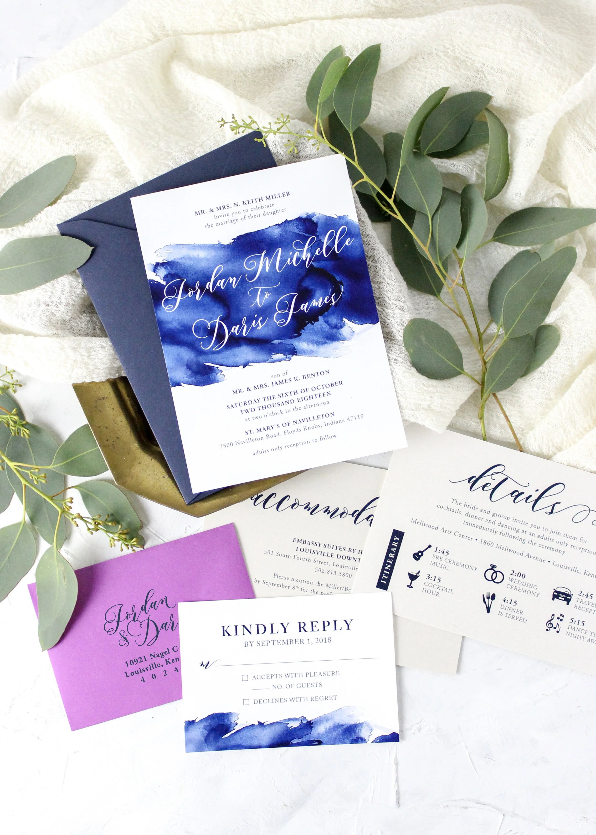
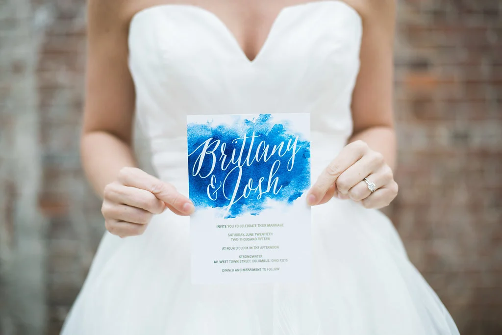
This calming shade of blue makes for an elegant addition to any wedding style. Whether used as an accent or base color, classic blue brings a sophisticated look to your stationery experience.
Many of my clients have incorporated a similar shade into their wedding invitation designs. Watercolor invitations are especially popular in this shade of blue. We especially love the look of the watercolor in a painterly delftware floral pattern.
Our Elizabeth wedding stationery suite is a perfect option for incorporating classic blue into your wedding scheme. Elizabeth is a part of our semi-custom collection. With text and colors fully customizable on to fit your design needs!
For even more wedding color palette ideas, follow us on Pinterest where you can find wedding cake, reception decor and even destination wedding inspiration.


